I’ve been asked a couple of times why did I decide to make Twelve Minutes top down. Besides aesthetic and thematic reasons, one of my main goals was accessibility.
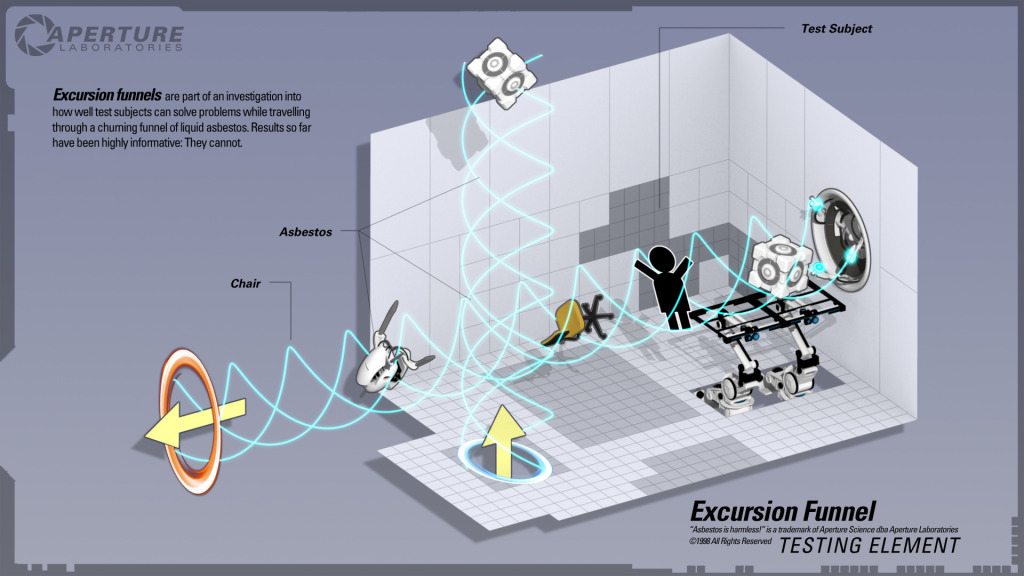
About 2 years ago, I sat down with my wife that hadn’t played games since she was a kid. I wanted to show her how fun Portal 2 co-op can be.
After over one hour of playing the game, she was still struggling trying to figure out the basic first person movement controls using a gamepad, and we hadn’t even started to talk about the Portal gun!

This made me realize once again how big of a gap still exists between gamers and non gamers, and how its so easy to make things inaccessible.
For this reason, consoles like the Nintendo Wii and the advent of mobile gaming are a great help in creating this awareness, now we just need to catch up and start creating more relevant gameplay experiences!
For this project, one of my goals is for someone that never plays videogames, to be able to sit down and immediately understand and connect with the game without sacrificing the experience.
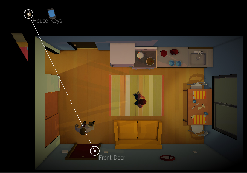
This is one of the main reasons for a top down view. By removing the third dimension its easier to navigate and have a good spacial awareness of what is going on. What it removes in terms of immersion it brings back in terms of clarity.
The other part was to have an accessible user interface. I’ve always been a big fan of the old ‘point-and-click’, and how you can do so many different interactions by combining objects with verbs, but I also remember how I would end up frustrated trying to “guess what the designer wants you to do here”.
That is a very hard problem to solve, and something I hope I can alleviate somehow, but I believe the old ‘verb’ overcomplicated interface only adds to the problem.

In Twelve Minutes you combine different items by dragging them. As long as each object can convey its purpose (e.g. Key + Door) there is a lot less trial and error and most solutions end up being found by logical deduction (or so I hope).
I was happily surprised to find that this system allows for a huge range of interactions and is still very intuitive.

I too have noticed more and more the level of skill that is needed to play video games in particular. When we as a culture are reinforced with a standard level of skill necessary to play the games that our friends do, it’s hard to remember what it was like to not have the manual dexterity to really get into a game.
So I completely appreciate the attention you’ve given to accessibility in this case. I hope it has the desired effect!
I had a lot of fun with this game: http://thesilentage.com – it’s a “classic” adventure game with a very simple & easy to understand control scheme. Check it out! By the way, does it still make sense to draw the game using 3D? Wouldn’t 2D be even more clear & easy to comprehend visually? Is it just that you’re setup for 3D and it’s actually easier for you or will there be some parts of the game that actually rely on the 3D graphics/animation? Anyway, I’m looking forward to playing Twelve minutes. Thanks.
Good observation. I actually worked on the game with an orthographic camera for quite some time until I focused on getting the right mood for the apartment different rooms and realized that you wouldn’t be able to see the walls and it just feels flat. The game also uses cones of view to block what you can’t see and lighting is part of the gameplay so in the end perspective made a lot more sense. You can also ‘zoom in’ on certain objects which gives you a 3D camera so in the end, to keep the whole thing more uniform, 3D is better.