For the last three years, I had to remind myself that the current art was just placeholder and stop myself from trying to make it prettier. As the game design developed, I just kept gathering references, inspirational art and would write down any ideas that I felt were relevant for the visual direction of the game.
At long last, the production has reached the stage where the art is the focus and over the last months, we’ve been hard at work getting the visuals up to date.
This post will cover some of that process and introduce the artists that have joined the team.
Production art has to juggle two main variables; the vision it is trying to achieve against the technical limitations of the engine and current hardware.
I’ve always preached that you should ignore technical limitations while figuring out the art direction (so you don’t just stay inside your comfort zone) but you also need to be aware of how much room the engine will give, unless you have unlimited budget, time, and a very talented/expensive R&D team.
A good example is the previous project I worked in, The Witness. We not only had some of the best programmers I’ve ever known but a custom-made engine designed focused on good global illumination and that could handle long draw-distances, LODs (Level-of-Detail) and asset streaming.
For Twelve Minutes, it’s almost the opposite…there isn’t really a programming team; I’m not using a custom engine and we are focused on an extremely small apartment (with only 3 rooms) for the entirety of the game. So we need to know what kind of lighting we can have (real-time/ baked); what type of shaders (PBR) and what are the advantages/disadvantages of having such a small concentrated play space (polycount, framerate, etc).
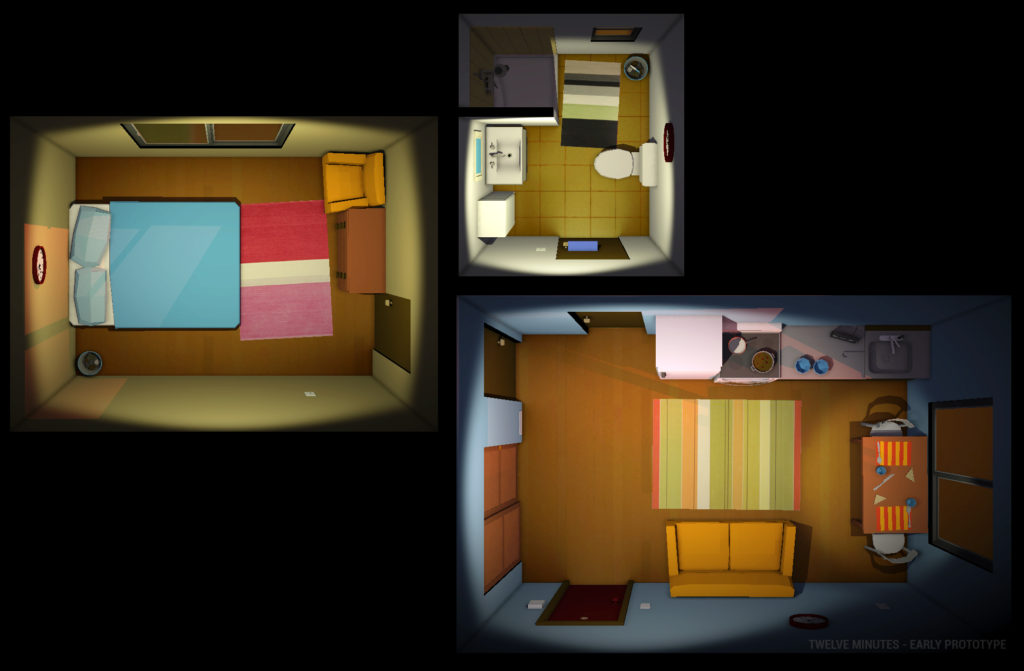
The apartment is just like any of the other characters in the game. It will non-verbally communicate who the actors are, their lives and choices. In parallel, lighting will play a big part in creating the atmosphere and convey emotions.
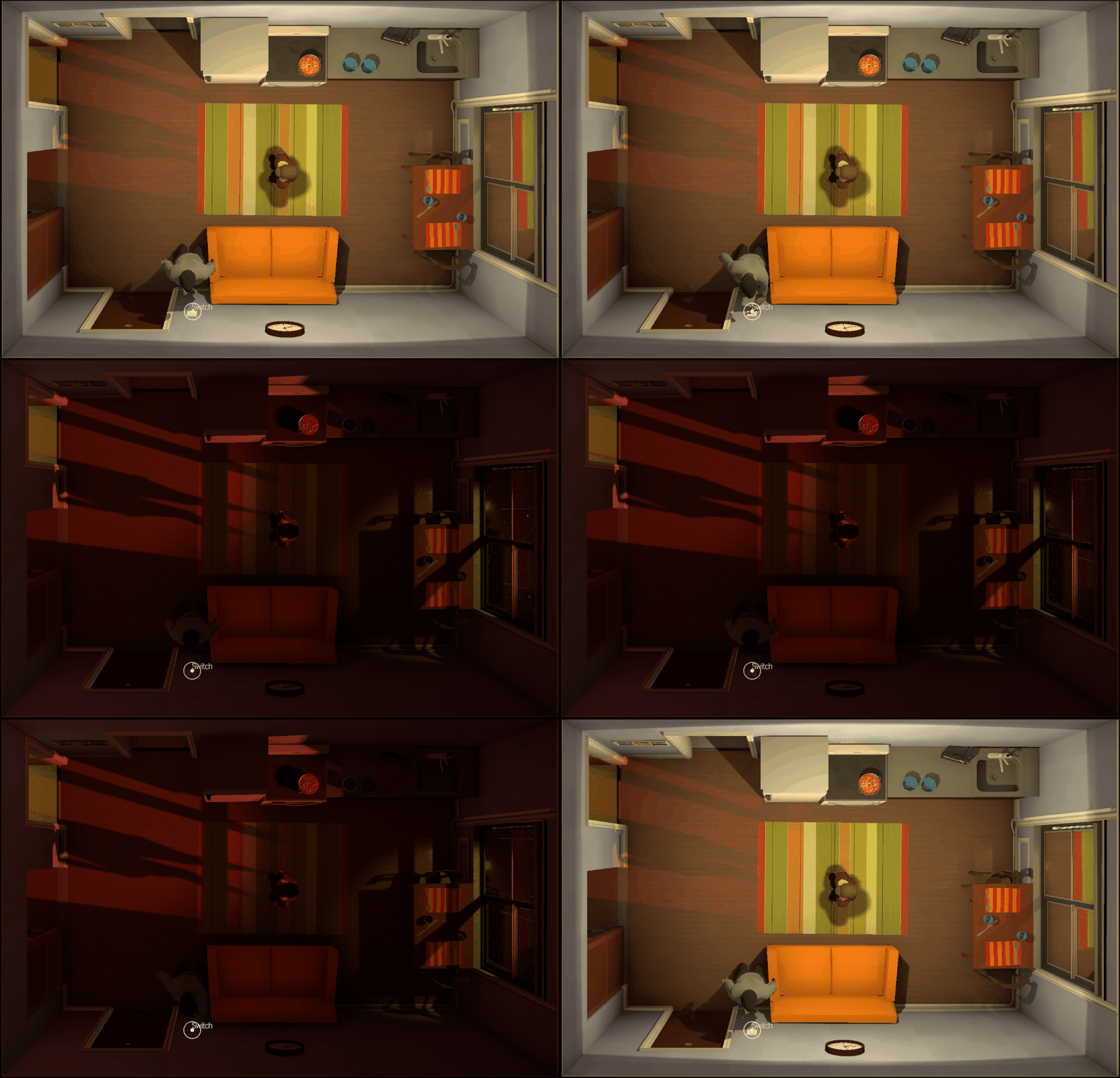
After some testing, I realized we might be able to have a dynamic light system with real-time global illumination. What this means is that not only every light is dynamic (can be moved and turned on/off) but we can also have real-time indirect lighting (light bouncing off the surfaces) in static (walls and floors) and dynamic meshes (e.g. characters).
To feel realistic, you also need reflections to match the light changes, but doing them in real-time is extremely expensive but fortunately, the engine supports custom reflection probes.
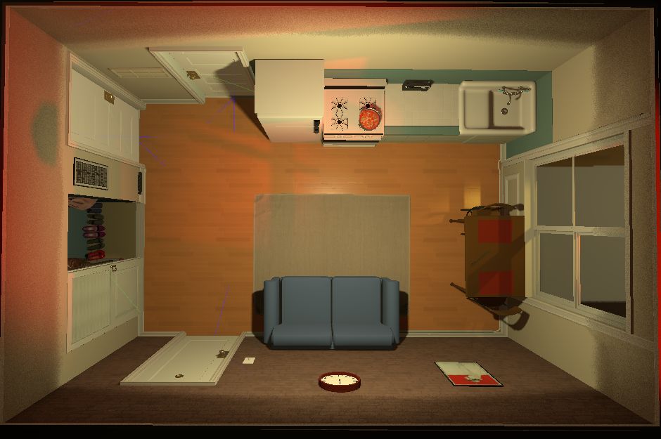
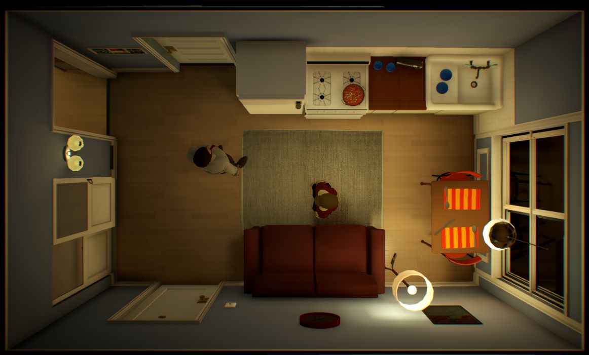
Below is the first successful test with the placeholder art. Notice that the exterior red light, as well as the interior white light, not only illuminate the room but they bounce off the walls, adding a tint to the surfaces rather than being pitch black. Also, the window reflection changes based on the light state giving it a more realistic feeling.
In parallel to those tests, we started creating the apartment new art. After the initial pass from the writers, to understand who the characters are, their background and motivations we were in a good position to figure what choices to do for the environment art. What kind of apartment would they live in? What is their taste in decoration? What kind of furniture would they buy/can afford? Are they clean/lazy?
Updating the assets changed the scale of the environment and how we perceive it. A bed that used to look like a box is suddenly detailed and becomes the center of attention. And walls that were empty but were not distracting suddenly feel incomplete. What is the right level of detail that allows us to keep the environment readable for gameplay and at the same time creates a narrative that you could believe someone has lived for the past 10 years?
Once we find the right balance, then we can ‘lock’ the assets and move to the next step of giving them personality, wear and tear and the small details that make them feel unique.
The biggest part of this kind of process is just doing it. You can theorize what works and what doesn’t, but only when you have the actual assets in-game and you played it over and over, is when you truly know. This means that there is a lot of iteration and sometimes wasted work.
In reality, a lot of the process is by removing the wrong choices until there isn’t anything distracting or that breaks the game design, rather than what a lot of people assume is making the right choice.
There has also been a lot of thought into the color palettes and color meaning but I don’t want to spoil it so I’ll let you be the judge of how well we achieved this once you play the game.
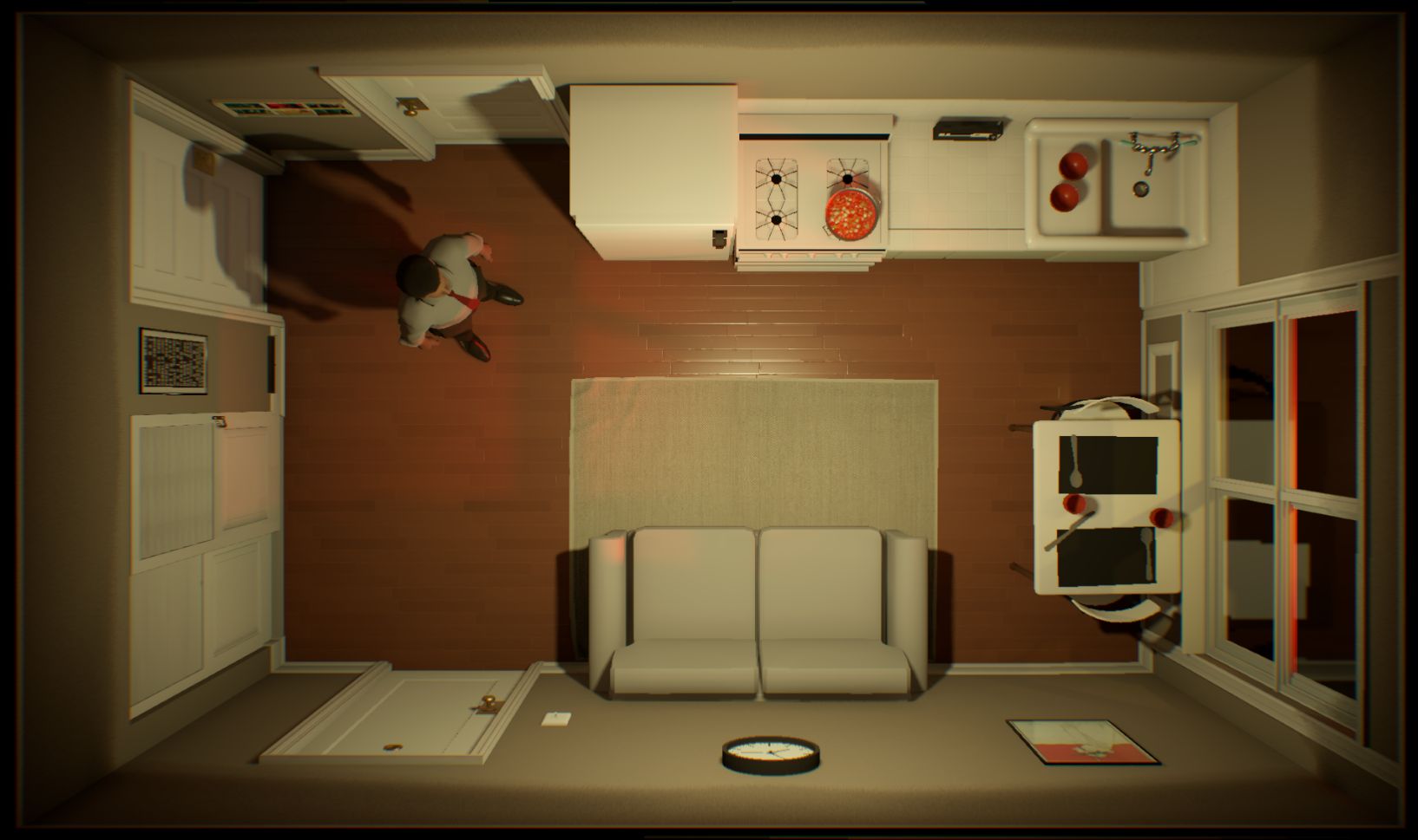
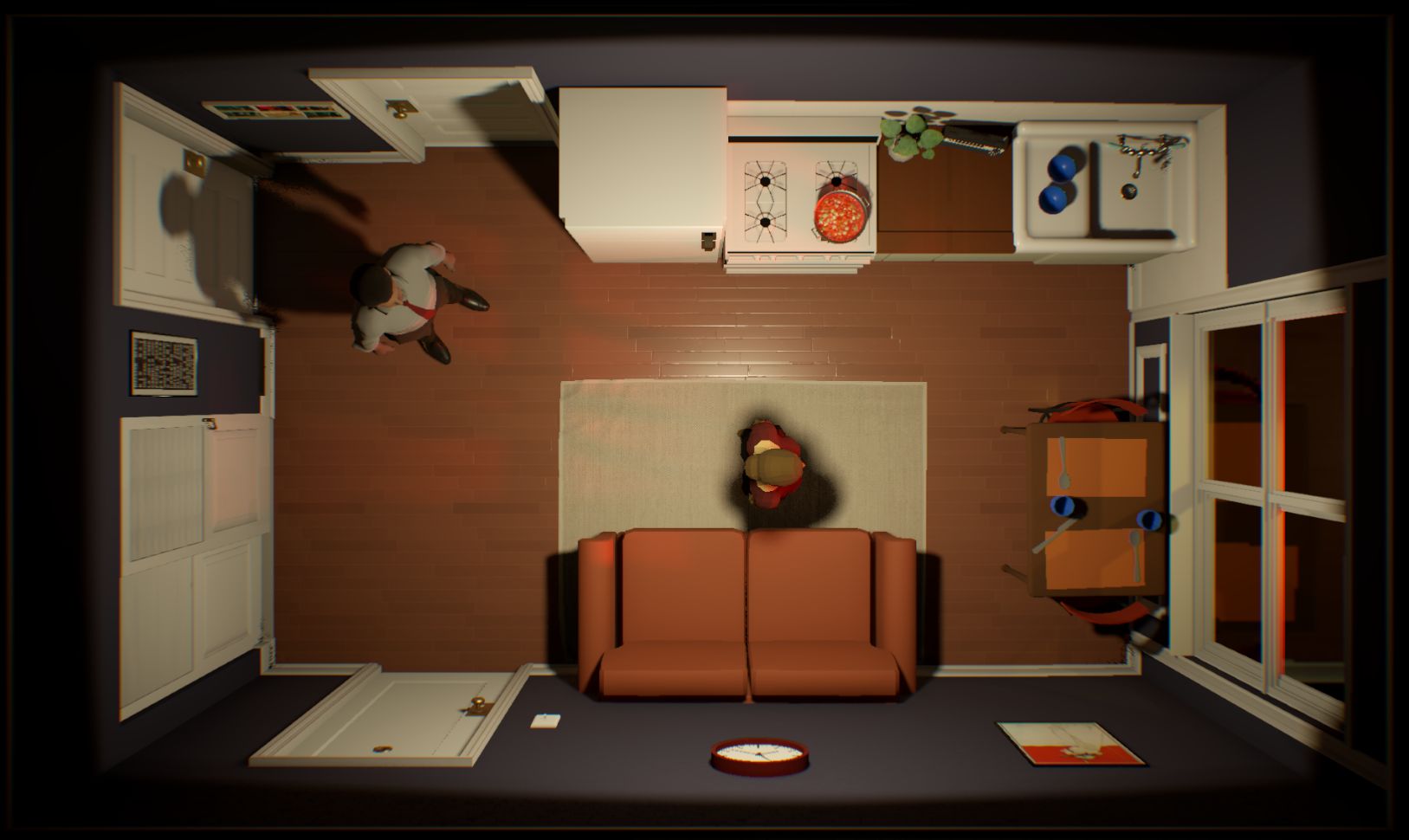
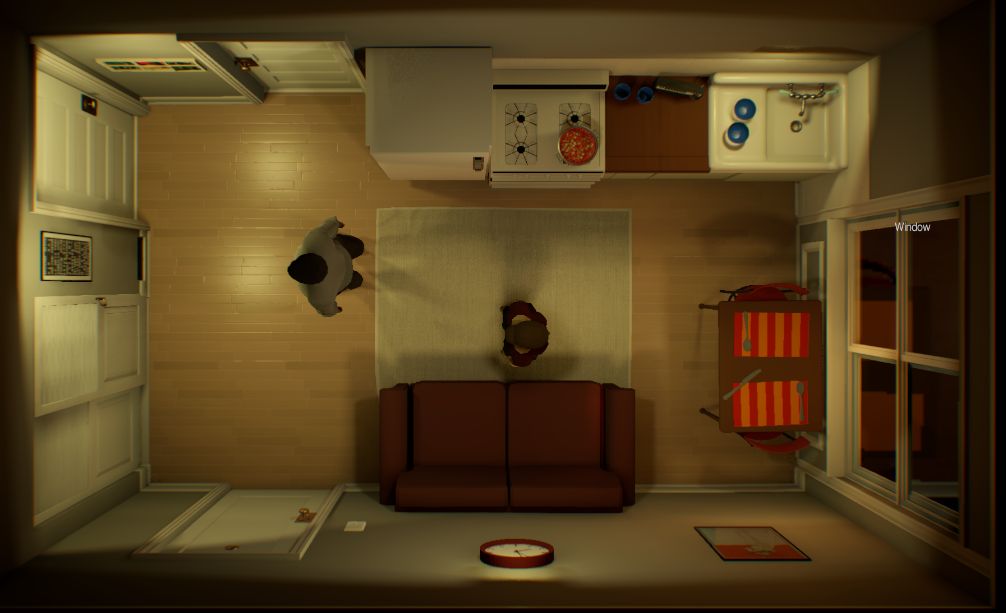
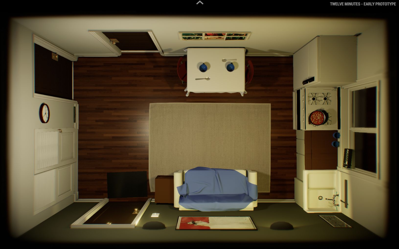
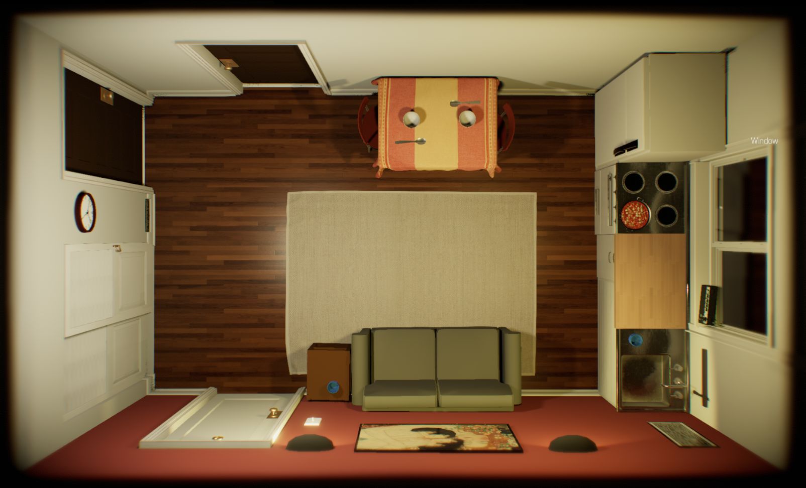
Below is a sequence of images taken during the iterative process of updating the living room. Be aware that this is still the first pass which means that the rooms are still flat colored and the furniture looks brand new but we already have accurate material properties, colors, and scale. Once we are happy with the results, then we will give it personality and bring that ‘lived-in’ quality.
(You can also click on any image to see the sequence in higher resolution.)
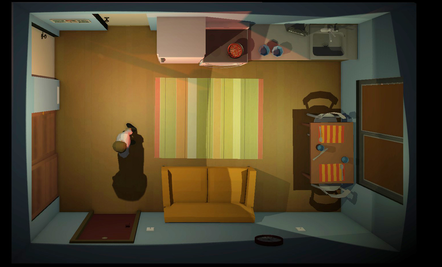
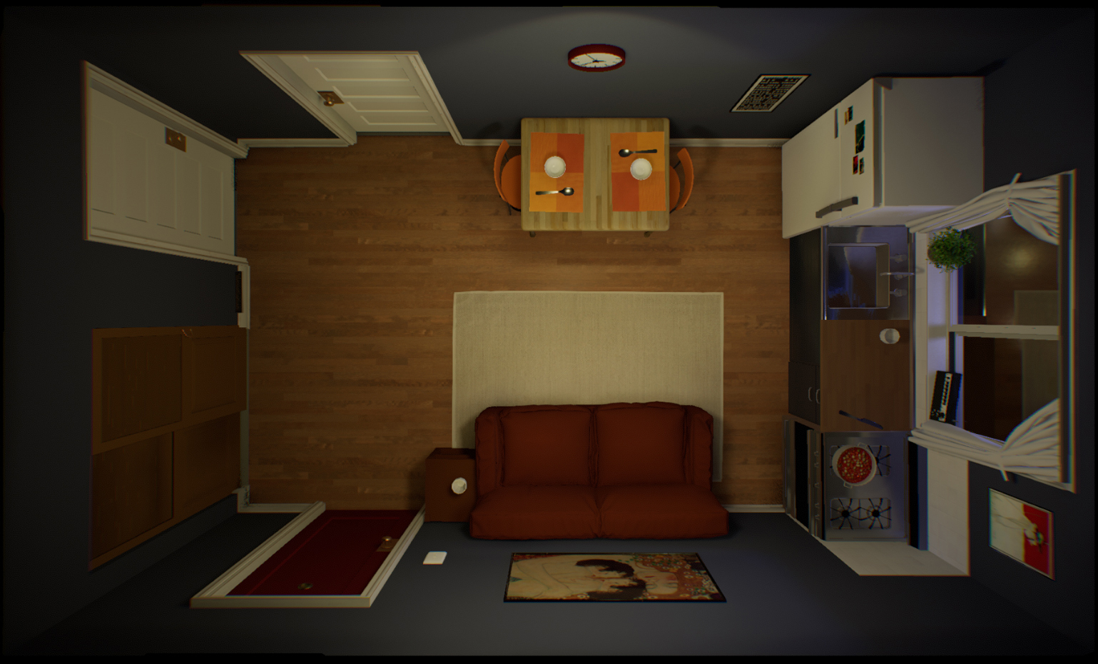
And for comparison, here is the before/after for each room. Once again be aware, we just started the process of replacing the art and we are far from complete (already with a long to-do list of changes/fixes). This is still a work in progress, but a pretty substantial one worth sharing.
Living Room
Bedroom
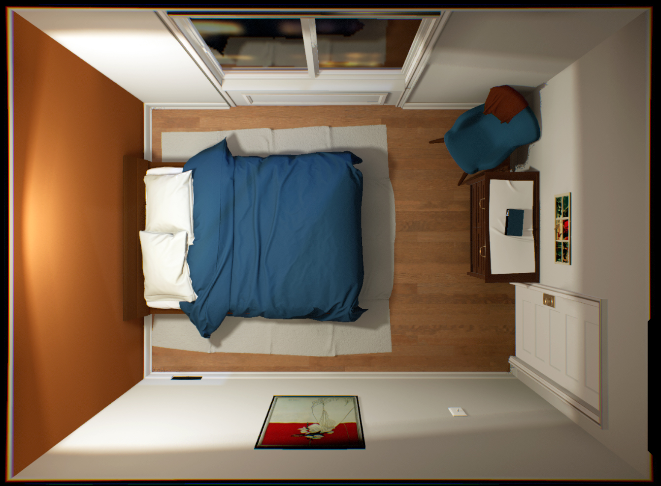
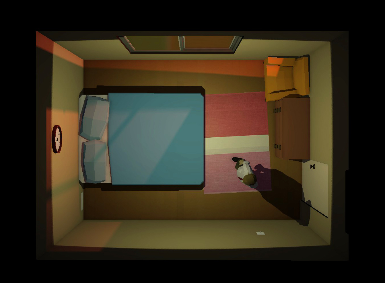
Bathroom
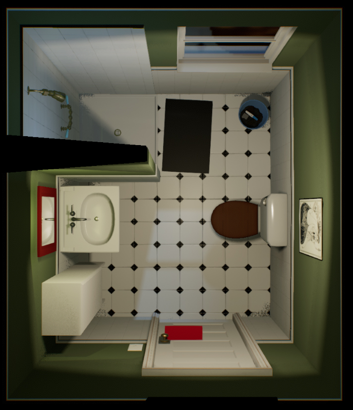
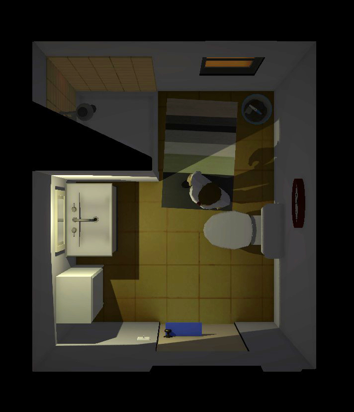
This stage of the production also means figuring out small fun technical details, like how will the traffic outside be rendered and how it will move:
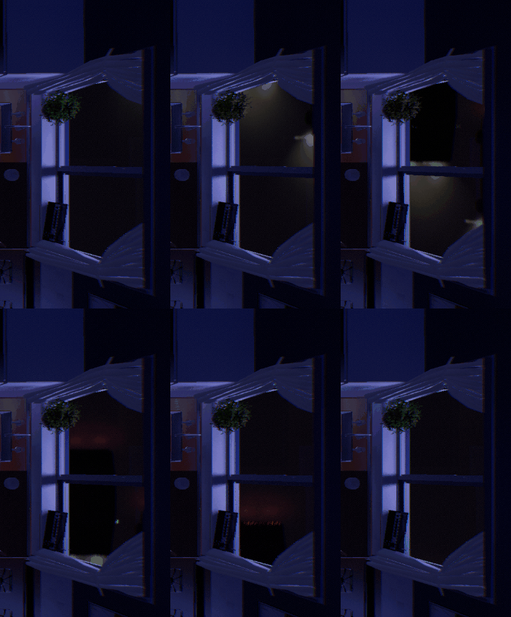
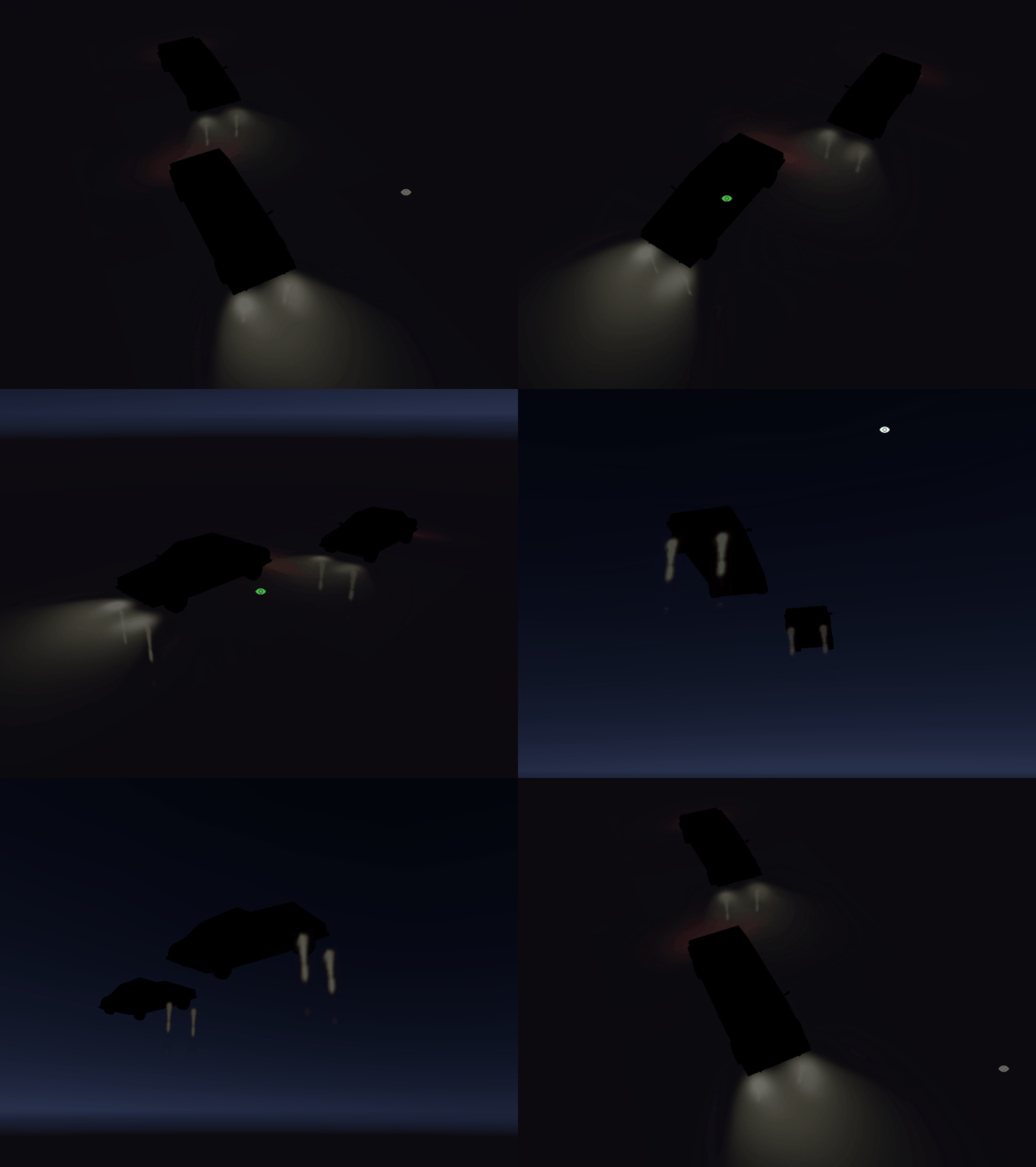
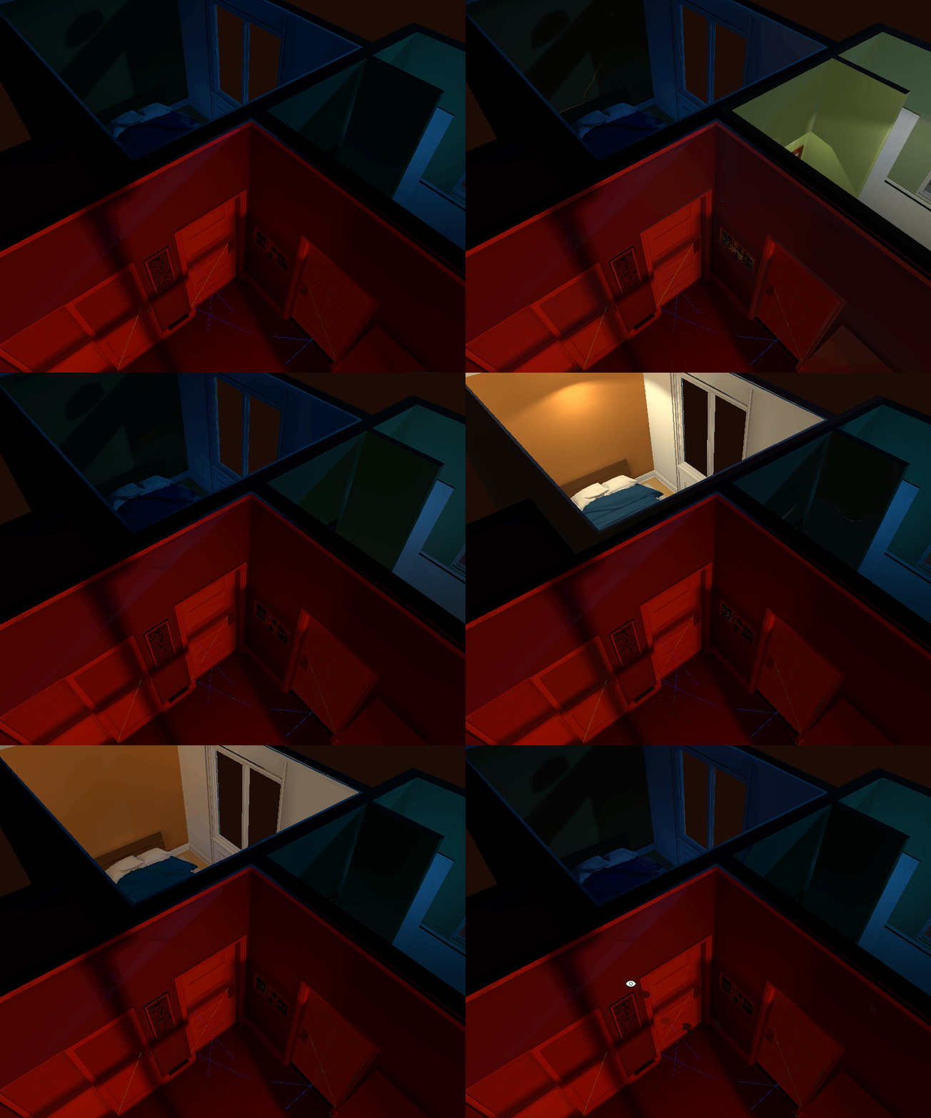
Along with more frustrating technical issues, like making sure there aren’t any light/reflection leaks between rooms:
The Art Team
My journey as a game developer, up until this project, was focused on production art. That in itself is a full-time job, especially if you are indie and have to focus not only assets but also concept art, art direction and tackling any other challenge that comes your way.
So for Twelve Minutes, it meant I needed to find other artists that would be able to give the art the love and time it deserves as well as understand how closely related it is to game design.
And so I’m glad to introduce you to the people that are making that happen for this project!
James Stout – Environment Art
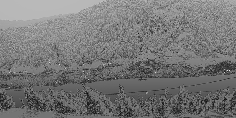
James Stout is an artist from Port Hardy, Canada. He moved around for a handful of years, working with Capcom Vancouver, Relic Entertainment, Guerrilla Games, Ubisoft and Hangar 13. After settling in San Francisco, he’s happy to be working with a smaller team, trying to make something that pushes himself.
João Sapiro Josué – Character Art

João is a 3d Artisan located in Lisbon, Portugal and currently working for Airborn Studios as a Senior 3d Character\Hardsurface Artist. He has worked on some high profile titles, more recently Overwatch and Halo5: Guardians, among others. You can check his work here.
Jonathan Nascone – Character Art

Jonathan Nascone is a Lead Character Artist living in San Jose who has been working in the games industry for over 14 years. For the past 6 years, he has worked on the MMO’s Star Trek Online and D&D Neverwinter Online. Before that, Jonathan has worked at Ubisoft, America’s Army and a contractor at Gearbox Software.


Everything is absolutely gorgeous so far! The lighting looks so realistic, it really feels like a home.
Wow, at this point I didn’t expect anything like switching the arrangement of the kitchen table and the rest of the kitchen furniture. For some reason now it looks more believable to me so I like it better this way. But was this change small enough to not affect anything time-wise or did you need to be careful about changing the distances between different places in the apartment?
That’s a good question.
Once the apartment was more detailed, it became obvious that having the couch facing the kitchen was just unpleasant (Imagine you want to sit down and relax and you are just staring at a fridge and oven).
The other reason was that when you are washing dishes or cooking, it’s kinda nice to have a view, so we thought, why not move it to that wall?
Finally, in the previous version, the table was getting smashed in the right corner, and the window, rather than feeling like a romantic spot, it just felt cluttered.
Once we made the change, it all clicked into place. Nice view to cook, a flat wall next to the dinner table allows us to frame it with the painting to create the mood, and sitting on the couch is much more comfortable.
In terms of gameplay, it caused some small changes, but since we know what the game space and experience are, it was easy to work around it.
How about having different version of every furnishing (furniture, walls, decorations, etc) and have them randomly change for every time loop? So time is not actually looping but you’re just replaying the same time frame in a parallel dimension. Too distracting or heartless (can’t save the original characters)?