Personally, one of the most impressive aspects of movie making, is how it’s able to use every single technique, from camera movement, to set design, pacing, acting, colors, etc. to convey a message without having to literally spell it out. On the other hand, when you get lazy writers or a soulless commercial sequel, you end up with drawn out exposition dumps that take you out of the experience.
A recent example that stood out for me, was the starting scenes of Foxcatcher, establishing the personality of one of the main characters with barely any words (from around 1:23 to the 5:50 mark):
Notice how so much is said by the cinematography, the actor expressions and the general mood. On the opposite side of the spectrum, we have movies like Inception. A great concept, and a stylish movie, but plastered with in-your-face explanations that should have been conveyed differently. Funny or Die did a great “Every Question Ellen Page Asks in Inception” clip you can see below that really drives the message:
And how does this relate to videogames? What made me want to write this post in the first place, was a similar experience I had with the recently released Hitman. Before I go into a rant, be aware that I’ve played all Hitman games and I’ve been a huge fan of IO Interactive since 1998 and their first iteration of Agent 47. I love the stealth genre, so my expectations for this sequel (hopefully capturing some of the awesomeness of Blood Money) were high.
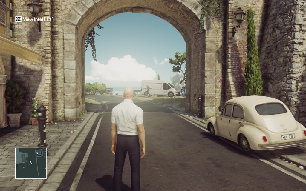
The second level is in a small town called Sapienza. You start outside, in the open, and have to figure out how to get inside a small villa to murder your target.
As the episode starts, you have that unique moment of not knowing what lies ahead, and for a few seconds, you think your possibilities are endless. I couldn’t wait to start analyzing the environment to try and figure out, by myself, how I could get inside.
I walked a few steps to the left and saw a a small truck on the side of the road with smoke coming out of the hood. Pretty hard to miss , so I decide to check it out, maybe it could be useful somehow?
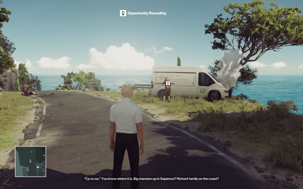
The moment I stepped a bit closer, a big fat icon pops-up in front of the guy next to the truck and a message on the screen saying “Opportunity Revealing”, completely ruining the immersion and all the work that went into the design of that scene. I mean, look at it…do we really need that UI prompt?!?
A team of artists, animators and designers, crafted this scene to tell you a story. The biker that was hit by a flower delivery truck, and the guy on the phone trying to sort it out. All the information is right there, laid out in front of you! It’s not like this game has a million different paths to go, so this setup already stands out like a sore thumb. Why did they feel the need to ruin all this work by telling me what is happening?
My problem with this attitude, is that it not only shows the game doesn’t trust itself, but it’s also not trusting the player. It’s clearly saying “Were not sure if we managed to convey that there is an opportunity ahead, so we will spell it out for you.” as well as “You are pretty dumb, and likely to miss this obvious clue, so we are gonna tell it, just in case.”.
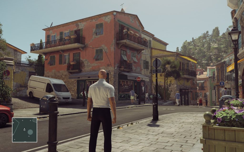
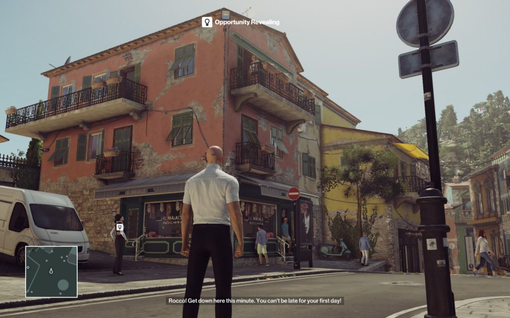
And this is not an isolated incident, if you decide to head in the opposite direction, guess what happens? Exactly the same problem, the moment I pick up on the clues of what might be useful information; a woman on the street level talking with someone else on a balcony:
The intrusive UI pops-up and says “Opportunity Revealing” , with another big fat white symbol on top of the girl, just in case I was maybe looking at the lamppost, I guess….
Subconsciously, these design choices set the tone and change my relationship with the game. It sets the standard for a “This is a dumb game, and I’m not expect to connect any dots.”.
There is no need to try and be careful, there won’t be any subtlety and I won’t have to pay attentions to my surroundings.I won’t experience being a Hitman in the way I play the game but instead it will happen when the game tells me to do so.
I get frustrated just trying to imagine how cool it could have been if the game didn’t say anything, and I would feel that it was me that saw this opportunity and took advantage of it!
While working on The Witness, it was interesting to notice that a lot of people assumed, when they couldn’t figure out a set of panels, that the game was broken. Instead of realizing that maybe they were missing some clue. I don’t blame the gamers for any of this, if I hadn’t worked on that project I would have probably felt the same way.
Most story driven games nowadays are too straightforward and clearly marked as “Leave your brain at the door” experiences, so when someone delivers something more complex, they have to fight back expectations and explain clearly why it’s different.
And I’ve seen similar issues happening with Twelve Minutes, where playtesters that are used to point-and-click games naturally try to gather all items immediately and start combining them without any thought process, just brute forcing to ‘unlock’ the next sequence, only to be frustrated when they realize they need to be active participants to progress in the game.
These are both issues that I’m trying hard to avoid. Exposition dump through dialog, rather than relying on environmental storytelling as well as hand holding you at every challenge. I feel a lot of fixes are already in place, but as the game gets more refined, it should be more obvious.
What about the actual development? What have I been up to?
Over the last two weeks, like I mentioned in the previous post, I’ve been cleaning up the code and tying up loose ends. Three years ago, when I decided to learn Unity and how to program for this project, I had to choose between two languages: UnityScript (Unity’s custom version of Javascript) or C#.
From the perspective of someone that knows zero about programming, and my gut feeling, based on how big the community support was at the time and how much easier it seemed to be to learn the syntax, I went with UnityScript.
About a year and half into the project the first alarm bells started to ring. Being a dynamic language, UnityScript allows me to get away with a lot of bad coding practices, and when debugging, it becomes much harder to track down what the code is exactly doing.
A few months after, as Unity was updated with newer versions of Monodevelop (the default IDE that ships with Unity) I started to get frustrated at how many times it crashed or froze as well as how many features it was missing compared to a package like Visual Studio. As an artist it felt I was using something like Microsoft Paint, rather than Photoshop. I decided to see if I could find an alternative IDE but no one supports UnityScript since it’s a custom Unity language.
As time passed, I noticed that UnityScript was kinda getting forgotten, from Mecanim State Machine Behaviors being only supported in C#, as most of the plugins I use being written in C# (forcing me to shuffle files around to make sure the compilation order is correct) , and finally noticing that Visual Studio, that now ships with Unity, dropped support for UnityScript.
So I sat down, and asked myself…should I learn this new syntax and change the whole codebase to C#?
It’s a pretty daunting tasks that could easily take over a month but I couldn’t find a single reason to justify staying in UnityScript apart from the time I would lose converting all the code and fixing whatever gets broken in the process. And since the game will just grow in complexity, I should bite the bullet and do it right now, rather than in a year or even later, when I’m deeper into development.
So I decided to go for it, and for the last week I’ve been avidly re-writing all the code in C# and learning Visual Studio. And I’m relieved to finally be able to share that the game is now running exactly as before, but this time without anymore UnityScript!
Also, due to the precision of C#, I realized I had quite a few errors on my code, details that I was somehow able to get away with that were just plain wrong.
I’m not a big fan of re-writing code unless it’s needed. I feel it’s easy to fall into the ‘optimize’ everything trap and end up limiting your possibilities, losing too much time ‘improving’ everything and just not get that much out of it. But in this case, I feel it was justified since the last thing you want as a developer is to fight your own tools and pipeline.
To end this post, now that I’m not doing two projects at the same time, I’ve found the time to get back to some activities that I love, like Life Drawing. And since I don’t have any new art content to share, here are some sketches I did on my last session:


I turn off the opportunities in Hitman in the option menus. My favourite game of the year so far, I love the player agency
I think you’ve nailed it, Lucy. The option is there to have the prompts taken away.
However, should the prompts be off by default? Should you choose a difficulty explicitly that changes whether they are on or off? The opportunity system does feel a little at odds with the rest of the game. Setting off events by listening to conversations seems kind of dumb, but then I can’t see much of an alternative – the conversation needs to happen when you’re on earshot, not just at some point during that NPC’s day.
I personally play with minimal hints on, but enough that I realise something important is being discussed that opens up new opportunities. I originally didn’t like the way it shows you all the challenges so you know most of the ways kills can be done, but some of them are redacted and the fun comes not so much from figuring out what to do, but more how to do it.
I think the point about games in general is a very good one. The classic COD floating “follow” above someones head is really dull, whereas Dark Souls barely tells you anything and is infinitely more engaging and rewarding an experience as a result.
I think having the option to turn off UI elements is vital, but I understand why they’re on as default. Publishers and developers need to pander to the lowest common denominator in order to maximise sales. Basic capitalism. So those who want a more hardcore experience have to dig in menus. At least the option is there.
Funnily enough, after playing the beta that consisted of the two training levels I nearly wrote off the game because of the opportunity system. Sometimes pandering can isolate your core audience. It’s a hard line to walk.
I’ve been a long term Hitman community member for years and frankly I’ve seen this exact same argument made literally every time a new game is released because this isn’t actually about the game design.
It’s about the pretension that “I don’t need this so nobody needs it.” and the assumption that a game intended to be marketed to millions should be tailored to one individual who is particular good at x, y or z.
Yes if you have trained your observational skills there is a lot of information that feels over-projected if you have all the options designed to assist you switched on. That’s to be expected when the game has to also be accessible to who have never played a game like this and to whom it doesn’t even occur there will be information provided.
That games which don’t do this such as Dark Souls are considered punishingly hard by many and lead to many people hating them, as well as many older games being unplayable to many due to this, is a pretty good indicator that the audience shouldn’t be trusted.
Perhaps you should spend twelve minutes pondering the spectrum of people who play games rather than assuming it’s an endless army of clones of yourself?
You can still build accessibility without having to resort to cheap solutions like having a ‘in your face’ hint. It does require more time and effort, and from an investor POV it’s also riskier but if you pull it off, it’s sublime.
That is why I started the post by showing two examples with movies. A character can express sadness through its emotions, or just say “I’m sad” and for sure you’ll get it, but you will be missing something out of the experience. The sub conscious effort that you have to do to get these subtleties makes you an active participant and naturally more involved in the moment.
A great example of this in gaming, and one of my favorite games ever, is ‘Shadow of the Colossus’, with very minimal and thoughtful design that hides great complexity in its simplicity.